Suuup - DISCLAIMER!!
BM Group: We have decided that we are only going to produce the following images and they will/can be used across all mediums. This is to help bring the campaign together and more in sync (most campaigns only use 2 - 3 types each focusing on the same theme, not 10 images to cover each demographic (we have reduced your sub demo's of (working parents, working in city, singles, teens and simplified it to Seniors (slightly more PC than pensioners), Youth and Families).
Tech Trends: We have come up with the concepts, however we think we may need to shoot some of them differently to apply to each medium (ie a poster is a different size to a web banner) would you please be able to help us out by suggesting ways in which we can produce the same images to fit each of the mediums. We are pretty positive that this can be achieved. - Or link if you have already written abot it just to keep it in place.
:-D
Seniors (Traditional)
IMAGE: Back of an old person sitting on a deck chair on the beach or picnic chair at hinterland with freaking sweet lighting (ie warm/sunsetty/afternoon). The view that the people are looking at will be the beach/bushland.
MOOD: calm/relaxing
PROMOTING: Hinterland/Beach
LOGO: wouldn't you be sitting here/relaxing here/checking out this sweet ass view (needs tweaking hah) - BM GROUP PLEASE RESPOND
Seniors (Active)
IMAGE: A senior couple each lying on a surfboard in shallow water (attending a surfing/board rider lesson instructor is looking on enthusiastically, guiding them). Both of them looking at each other lovingly with huge smiles on their faces.
PROMOTING: beach/activities for more active seniors
LOGO: COME AND FALL IN LOVE ALL OVER AGAIN...THE GOLD COAST!
For posters, this could be placed on the back of chairs in buses, trains etc.
_____
Youth
IMAGE: Combine two images into one medium - imagine those hologram type images where the angles you view it changes the image..
Image One (watersports): back of guy one hand on jetski/wakeboard and other arm up in the air
Image Two (nightlife): same guy/posE but change background to a club/bar scene
Image One (watersports): Girl on a board in a barrell/tube with hand out touching wave changing to dancing/spinning around a club wih arm out. **BEN FROM TECH TRENDS, WOULD APPRECIATE A COMMENT ON HOW BEST/IF POSSIBLE TO DO THESE IMAGES)
MOOD: fun, bright, energetic
PROMOTING: Watersports/Nightlife
LOGO: BM GROUP PLEASE RESPOND WITH A SUITABLE TEXT/SLOGAN FOR THIS IMAGE(S)
_____
Families (TECH TRENDS - please comment on this image in relation to water proof equipment etc)
IMAGE: family (2 parents/one child) on the beach parents swinging child between them, (we have added the feature of the family pet (in this case a dog) to appeal to a broader family sensibility). (early morning lighting, (flash as fill **tech group comments?)) - image taken from dog's eye level (candid feel) running towards family so we see the family's happy faces. Dog will be coming out of ocean shaking water off (image can show water splaying everywhere). Natural background (excluding buildings)
MOOD: playful, bright, fun
PROMOTING: family daytime activities
LOGO: BM GROUP PLEASE MAKE SUGGESTIONS
-
Frances, Michael, Mel Watt, Liz, Richard, Renee
:-D
Thursday, June 4, 2009
GOLD COAST ADVERT PROPOSALS
With reference to Mel's previous post and S-M clarification, please consider the following:
MEDIUM MARKET LOCATION
BILLBOARD Family/single/pensioners 2@NSW/QLD 110km zone
1@Brisbane CBD 80km zone
4 capital cities 60km
110km: Large format images with very little text incorporating some directional information ie "250km to a new backyard..."
80km: Combination of imagery with some text incorporating information about Gold Coast aiming at those who are locals or visiting tourists ie "Gold Coast A New Perspective..."
60km: Imagery+text to appeal to those in vehicles who have time to 'think' about the Gold Coast ie"Jim Brown 46yrs, Eagle Heights walking through his favourite tourist attraction..."
BUILDING WRAPS Singles/family Melbourne CBD 10 stories
Melbourne in itself has inconsistent weather which mainly includes extreme colds and heat. Imagery could focus on sunshine, water, blue skys etc to aim for the emotional side of a holiday and consistent weather. adpHence Wraps as outlined by Technology group would look impressive with this coloured imagery ie "Perfection is only the beginning..."
Could Imaging colleagues please comment on other mediums including Posters and Multimedia.
KylieB
Thursday, May 28, 2009
GROUP DISCUSSION/TEAM BRAINSTORMING
We intially discussed the mediums we would use to promote our images although B&M are yet to confirm exactly locations and particular advertising mediums. Our thoughts included:
1. Billboards (also incorporting 3d/interactive billboards)
2. Family/kids magazines or brochures
3. E-toll environments
4. Internet/tv
5. Buildings/bus shelters
Without knowing exactly our demographics or market, we discussed the following concepts:
1. Images which could be seen on billboards focusing on the locals of the Gold Coast and selling their environments to interstate tourists. Images of a real local stating their name, age, suburb etc for example their image with the background of the Hinterland with text stating "this is my backyard, why dont you come and see it?.... Refer previous post for further
2. Projector image, large format which would be located in a busy mall environment. People walking towards a large projector where the see themselves walking into a Gold Coast environment such as a beach or bush. Emotions evoked by the feeling of really being there
3. Posters etc where the image is taken from inside a vehicle where people are looking ahead through the car and you can see other vehicles outside but the images of the rear mirror and side mirrors show gold coast environments
4. 3d interactive images where you virtually walk through the image but in a more closed environment such as a conference etc
5. In reference to cheeky billboards, you could use directional images that state 'come this way' with an image of a person close up with their arm pointing behind them towards the gold coast beach or hinterland.
6. Monochrome and colour image side by side as per previous blog 'Happiness in the backyard'.
On confirmation of demographics and marketing locations we will clarify our concepts further to match appropiately.
Cheerio for now
Re: Creative Ads by Mel
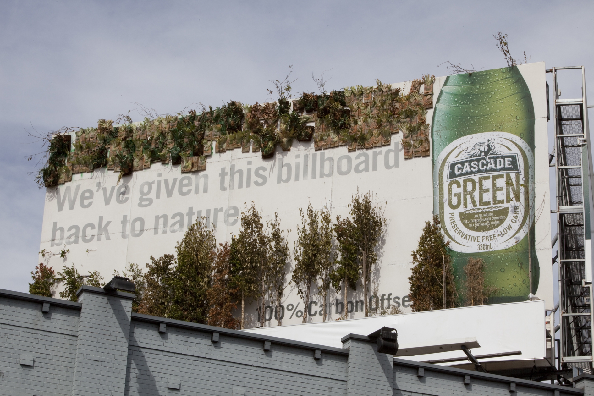
this reminds me of that billboard for cascade beer "back to nature" (advertising carbon offset production) that has all the potplants and stuff coming out of it.
CLICK HERE TO SEE BILLBOARD
could do similar, we take a photo of an awesome landscape (because obviously all out photos are awesome) then we could tie beach balls and palm trees and more native ones for the hinterlands (maybe image of people walking along a bush walk trail and someone reaching out to touch a tree (and we place the actual tree there).
fran.


Trends / Ideas
Advertisements today are under going a lot of experimentation and changes just to gain the customers' attention and create an impression that will create a special space for the brand in the customers' psyche. We see changes in advertising photography, in the kind of images, in layout and fonts used and many more things.
Yet another trend that we see in today's ads – is interactivity. More and more companies are coming with ads that require the readers to do something in order to communicate back. This trend is visible more in the online ads than in the print media. Sometimes the ads are fun and are meant purely for entertainment of the readers. While sometimes the ads communicate a benefit which can be availed by filling up a form or completing a questionnaire.
We see changing trends in layout and size of advertisements. Both in print media as well as online media, advertisers are experimenting with sizes and layouts in order to catch the attention of the readers. Of course, the layout of both the kinds of media are different and they are defined separately from each other.
The fonts and font size are also undergoing a lot of experimentation. Advertising professionals are using different fonts to gain the attention of the audience. For instance, the online advertisements have seen a major shift from the usage of serif fonts to sans-serif fonts in the advertisements. Again the usage of fonts and the size depends on the Advertising photography and the pictures used in the ad.
Here are some links to some advertising ideas:
http://www.john-turner.co.uk/main.cfm?pageid=FolioViewCat&catID=11
http://www.sitepoint.com/article/top-trends-online-ad-design/
Melanie
Wednesday, May 27, 2009
Cheeky Billboards
NSW had a cheeky campaign promoting tourism for northern NSW in Feb and March this year. They placed a billboard at the Goldcoast airport which stated 'the only high rises you'll see. turn right for the NSW North Coast' with an image of mount warning. See the link below to view the billboard. Maybe a similar version could be placed at Brisbane airport or in Northern NSW to continue north.
Mel
http://corporate.tourism.nsw.gov.au/Sites/SiteID6/objLib65/090213_GoldCoastAirport_TNSWPartnership.pdf
Mel
http://corporate.tourism.nsw.gov.au/Sites/SiteID6/objLib65/090213_GoldCoastAirport_TNSWPartnership.pdf
Monday, May 25, 2009
Happiness In Your Own Backyard!
Ever heard the saying: "Happiness is in your own backyard?"... Well it could be said that this is true now more than ever before..Given the current uncertain financial times, there has never been a better time to explore and discover the amazing view of happiness that is right here in our very own Gold Coast! Come meet the locals, whose everday reality is right here on Queenslands Tropical Gold Coast.
In response to the Brief, I would envisage the following Image Concept for this advertising campaign.
Using one large formatted (size/format yet to be confirmed with marketing) Monochrome Image, of a Gold Coast local, who's "backyard" consists of the beautiful hinterland..This B&W image would portray the local standing in front of the hinterland, looking very relaxed and laid back in shorts and tshirt, with a caption in white text saying "Wake up to Happiness in your own Backyard, Just like me"! with another Image beside this one, as a vibrant colour Image of a beachfront backdrop being the second Local residents "backyard"...perhaps with a Mother & Daughter ready for a swim, with the slogan, "Our happiness is right here in our own backyard, why not make it yours?!" What are you waiting for Australia?! Possibly using both Images within the same frame as a contrast between the mono and colour Image.
What do you think guys?? can anyone find an Image example for this??
Posted by Michael 26/05/2009


Bahamas on the Coast!
Tourism on the Gold Coast is likely to be marketed in a similiar way to any 'beach destination' around the world. I had a look at the Ministry of Tourism campaigns in the Bahamas to get some ideas. As we are focusing on a national campaign which basically means exposing interstaters to the Gold Coast, perhaps we could make it more intimate and friendly so that travellers feel like they are visiting friends in a new location.
From a photographic perspective, maybe images encompassing a local (with his name and details underneath)doing something he does every day but a tourist may find different or exciting. For example, bushwalking in the Hinterland with a caption such as "come walk in my backyard..."
Although this campaign in the Bahamas is more focused on one-on-one interaction, it may have some merit. Have a read and a look at the website if you think this may be something to consider"
Buddy Up in the Bahamas: A Cultural Tour
By Bill Belleville
"People to People" is a program created by the Bahamas Ministry of Tourism intended to give visitors, in their words, "a genuine and informal view of Bahamian hospitality and culture as you might see it when visiting a friend."
The program relies on Bahamian volunteers—many of them professionals—who agree to spend time with visitors in the spirit of international goodwill. You register for the free program by contacting coordinators at least three weeks prior to your visit, and giving them a bit of information about yourself, including age, personal hobbies, occupation, and special areas of interest in the Bahamas. The coordinators then match up locals to fit those profiles.
For instance, during a recent visit to Cat Island, I met Sylvia Larramore-Crawford, a writer from Nassau who greatly appreciated Cat's own cultural nuances. We drove around and met her neighbors, had lunch and dinner at her house, and later, visited a local club where Sylvia knew everyone, musicians and customers alike. We were even invited to church with Sylvia on Sunday (unfortunately, we had to leave before then
http://away.com/tripideas/bahamas-cultural-immersion-312628.html
KylieB
Sunday, April 12, 2009
LIGHTING TRENDS FOR BABY PORTRAITS
For those of you who love baby portraits, you might want to check out New Zealander photographer Rachael Hale at http://www.babylovecollection.com/ .

All her portraits are done in her studio using window lighting for its natural softness. The studio has a full glass wall down one side to allow plenty of natural light in, with multi sky lights above. Sometimes she uses elinchrom flash bounced off the white ceiling and walls to create enveloping light like natural light when working with very active babies. Rachael uses multiple props including bathtubs, miniture washing lines, bowls of fruit, coloured wall paper backgrounds, flowers etc where as photographer Suzette Nesire who also uses natural lighting prefers to use simple props e.g. rugs and crops in tighter. Rachael likes to develop concepts for her images prior to her shoot e.g. the baby holding a strawberry in her gallery was to show just how tiny their hands actually are.
More and more photographers seem to be moving towards building their studio to incorporate natural lighting for its softness. Do you know of any others?
Tuesday, April 7, 2009
TECHNICAL TIPS FOR BETTER PHOTOS
Perhaps a little on the technical side, but five trends suggested by writers at http://www.photosharingnuggets.com which will basically improve the quality of your photos. Some you may already have in your cameras, others maybe not.
In short, they will easily let you take MUCH better photographs.
These five trends are:
1. Noise Reduction
2. Geotagging (GPS)
3. High Dynamic Range (HDR)
4. Smarter Focusing
5. Photo Sharing.
We believe these trends will be much more important in the next few years than than just having more megapixels or lower priced cameras.
Let's talk about each of these trends, and more importantly, what this trend means for you.
NOISE REDUCTION
One of the biggest problems in photography is not having enough light to take great pictures, especially indoors or at night.
There are several ways to compensate -- for example, flash, a slower shutter speed, a wider aperture, or a higher ISO -- but each of these can create other problems.
There is now better specialized noise reduction software you can use to help solve this problem as well.
What this means for you: Over time, we predict more cameras and software will incorporate these features automatically, so it will become easier and easier to get great photos when there is poor light.
GEOTAGGING
Geotagging is the process of adding geographical information, like latitude and longitude coordinates, to a photograph. It's like having GPS in your camera.
Geotagging can be useful to help other people identify exactly where a photo was taken. For example, we've photographed many waterfalls in the Blue Ridge and Great Smokey mountains. It would be handy to know exactly where each photo was taken -- either for us, if we want to go back to a specific waterfall, or for others who also might be interested in photographing that waterfall.
Here's an example. "When we were in Southern California last October, we rented a boat and went up the coast a short distance. I imported this picture into Adobe Lightroom, and it automatically included the longitude and latitude (look at the GPS setting at bottom of this screen capture).
When you click on the arrow to the right of the GPS setting, it automatically opens Google Maps to that location. You can see how accurate it is -- it even shows where we were on the water! If you click on the map below, you can go to the live Google Maps page. Pretty cool..."
What this means for you: In the future, we predict many cameras will have geotagging built in. It will be fun to have the latitude and longitude coordinates (or even altitude information) of your photos, automatically linked with Google Maps.
HIGH DYNAMIC RANGE
One of the most difficult problems to solve in digital photography occurs when you have very different light in different parts of your photograph.
For example, a sunrise or sunset, a dark room that includes a window with bright light coming in (especially if there is a captivating view out the window), interesting bright clouds with a dark landscape, or any dark foreground framing a bright background.
The problem in these situations is that either you blow out the bright areas (they're all white), or you get no details in the dark areas (they're all black). Sometimes that's the effect. But if not, it's been almost impossible to get detail in both the light and dark areas.
You can now use specialized HDR software combining several similar photographs with different exposures. It works by combining three or more almost-identical images of the same scene: one with the dark areas properly exposed, another with the light areas properly exposed, and the third with the mid-tones properly exposed (which is probably the photo you'd normally take).
This software (for example, Photomatix, Bracketeer or a plug-in for Photoshop CS3), lets you combine the useful parts of each photo. It creates a composite to give you the best of all worlds (and even gives you some control of how to combine them).
What this means for you: Whereas this is fairly specialized today, in the future, we predict that cameras and editing software will have HDR built in so the camera can automatically take several photos and properly bracket your images to then automatically combine the best parts of each, giving you a compelling photograph of the sunrise, sunset, dark room, clouds, etc.
SMARTER FOCUSING
Cameras are getting a lot smarter about what to auto focus on. A great example available today is the face recognition capabilities in some of the Canon PowerShot cameras.
Face recognition means that the camera can detect a face in a scene, and then focuses on the face so that the face will be in focus (rather than the focus being on some other object you don't care about). Face recognition also guides the camera to optimize the the exposure of the face.
Since cameras often just focused on the nearest object, this can lead to a huge improvement in auto focusing. It also means that a person's eyes, rather than their nose (which is usually closer) will often be in focus, resulting in better photographs.
For example, if you want to take a picture of your daughter holding her new puppy, many cameras today will recognize her face and automatically ensure she's in perfect focus.
Further, as cameras become smarter and make better guesses about what you'd like to have in focus and what to blur, the quality of your pictures will improve.
For example, awhile back I took pictures of my niece and nephew throwing a frisbee (she's a champion frisbee player). I set my Canon XTi on "Sports" mode since they were moving fast and I'd never taken action shots before.
The camera did very well in terms of focusing on them and freezing the action. However, it selected settings that also had the background trees and dirt in very sharp focus. You can see what I mean in this picture of my niece about to catch the frisbee here.
As cameras get smarter, the focusing will likely automatically blur out this uninteresting background so it doesn't distract from the subject of the photograph -- in this case, my niece and nephew jumping to catch the frisbee.
What this means for you: Your photographs will improve -- we predict it will seem like the camera is "reading your mind" and taking the picture you WANT more often, rather than focusing on something distracting you didn't even notice in the shot.
PHOTO SHARING
As we've said many times, most people don't really know what to do with their photos after they take them. We're committed to helping people get their photos off their cameras and computers, out of their shoe boxes, and sharing them in new, exciting and fun ways.
There are already devices that let you upload your photos automatically from your camera's memory card to photo sharing sites over wi-fi. Many people have had good luck with the EyeFi card that can be added to your camera. This makes it very easy to start sharing your photos. But there are SO many more possibilities.
What this means for you: Over time, we predict there will be more -- and much easier -- ways to handle the technical aspects of photo sharing. And, the number of fun and exciting ways to share your photos (which is what this site is all about!) will continue to grow. Very exciting!
So let us know if you have seen any of these trends in action. A friend of mine has a compact digital camera which scans the scene and takes a photo when someone smiles. Pretty cool and yes we have tried frowning and smiling to see how good it really is - and it works!
KylieB
Thursday, March 26, 2009
Fake Emotion Photography

Fake Emotion Photography is a series of photographs entitled "Fake Emotions" done by Inez van Lamsweerde & Vinoodh Matadin which features exposed, naked models who are covering their faces with their hands. This effectively hides any feelings, emotion or facial expressions that the models may have shown. This emotion has been replaced by having artificial faces drawn on the back of their hands, effectively giving the photographers creative control over the emotions in the image.
Fake Emotion Photography
Monday, March 23, 2009
SHADOW FASHION PHOTOGRAPHY

 These images (published in Numero Magazine 2008) by fashion photographer Solve Sundsbo (Norweign photographer in London) caught my attention immediately. He is famous for his experiementation with photography though the lens. I love these images because the shadows give another dimension creating mystery. The shadows on the model appear to form part of the model's clothing, like a tight cat suit or stocking with patterns. I'm not sure if he is trying to replicate animal prints through the shadows as the model with the pocker dots above seems to be in an animal pose, maybe a dalmation? The added orange lipstick on the bottom image leads me to think about tiger stripes and her position is very cat like. See what you think.
Sunday, March 22, 2009
Dark Tone Photography
Dark Tonality (Low Key)
It is characteristic for the image in Low Key style that most part of the image is formed by dark, sometimes black elements, but most details are well discernible, and light areas are always bright and clear. The intermediary tones are expressed weakly, by dark sections of the tonal scale. Presence of separate bright spots is the necessary requirement. All the elements, included to the picture, with the exception of those, creating a key (tonal) accent, must not greatly differ from each other in brightness. Counter, counter- side and side light is most often used for the illumination. Evening landscapes are often executed in low key, including light sources to the picture.


It is characteristic for the image in Low Key style that most part of the image is formed by dark, sometimes black elements, but most details are well discernible, and light areas are always bright and clear. The intermediary tones are expressed weakly, by dark sections of the tonal scale. Presence of separate bright spots is the necessary requirement. All the elements, included to the picture, with the exception of those, creating a key (tonal) accent, must not greatly differ from each other in brightness. Counter, counter- side and side light is most often used for the illumination. Evening landscapes are often executed in low key, including light sources to the picture.
The use of dark tones in photography has become increasingly popular in recent years. It creates a specific mood and emotion in an image that wouldn't exist without it, and is more commonly found in fine art, landscape and low key portrait photography. Personally, I love this trend and use it a lot in my own work. Here are some examples of this style:


Thursday, March 19, 2009
Still Life or Portraiture?
DeviantArt categorises them under Still Life, personally I'm torn between that or portraiture. A seemingly growing portraiture and/or still life trend is the art of photographing miniature dolls. While some styles are still to capture the dolls just sitting around not doing much aside from looking like the lifeless doll that it is; a new, more creative style is emerging where the dolls are not only made up to look more human (clothes/makeup) but the actual photography style has changed to capture a more human side to them, close up beauty shots and very contemporary fashion-esque portraits.

I don't particularly know where this trend would fit in the commercial world.. certainly as an arty, anonymous portrait to hang on your wall it could work, or I think stock images for publishers etc would find a great use for it. Even in the fashion world, miniature mockups of outfits could be made and photographed - at a much cheaper cost then hiring an actual model too.
So I want people to comment on not only where they feel this miniature doll portraiture should be categorised (still life/portraiture) and possible uses/viability it could have in a commercial world.
For more images on this subject go to DeviantArt


Frannie.
Wednesday, March 18, 2009
Drowning as Art - clearly disturbing!


We can’t live without water and yet it can easily kill us; it’s both essential for survival, but with too much, it has the potential to be deadly. Whatever your thoughts on water, you cannot help but be taken aback by this series of underwater photos by James Cooper who plays on this very ideal.
Underwater is a mysterious realm into which we cannot venture unaided. Add spitting out mouthfuls of fake blood and toys, and you have some AMAZING photography. Viscous and prismatic, we are visually enthralled by its sights and sounds and within its heights and depths we can have an experience as close to flight as anything an unaided human will ever know. Though never far from our minds we know that this buoyancy can shift to prison without warning. Water is false freedom, and we are inevitably ether moored within it forever or expelled out.
Underwater is a mysterious realm into which we cannot venture unaided. Add spitting out mouthfuls of fake blood and toys, and you have some AMAZING photography. Viscous and prismatic, we are visually enthralled by its sights and sounds and within its heights and depths we can have an experience as close to flight as anything an unaided human will ever know. Though never far from our minds we know that this buoyancy can shift to prison without warning. Water is false freedom, and we are inevitably ether moored within it forever or expelled out.
Water as nature has beautiful qualities, movement and interest yet this photographer has plainly disregarded its potential and resorted to a disgusting perspective in my opinion. The opportunity to use the human form could have been adequately achieved through responsible photography. Appreciation can be given to the beautiful lighting and movement but this photographer's subject matter is appalling. Surprising, thought-provoking and creative yet disturbing and irresponsible at the same time. Would you display these images on your wall....I think not!
KylieB
If you cant help but keep looking click on the following:
KylieB
If you cant help but keep looking click on the following:
Tuesday, March 17, 2009
INFUSED HUES IN FASHION PHOTOGRAPHY
 A new trend in fashion photography that has developed over the last year, is the use of various hues in the image. Some images include added hues in the background only and others include the model and background as pictured right by photographer Matt Sundin (Based in New York). It looks like Matt Sundin aims to achieve this in-camera (i'm assuming using gels over flash lights or is there another way?) giving a more richer moodier feeling where as other photographers like duo photographers Sofia Sanchez and Mauro Mongiello (From Argentina based in Paris), add the hues in post production using layers and filters.
Check out http://www.emsfilm.com/ (for Matt Sundin) and http://sofiamauro.com/ to compare and let us know which style you prefer and why.
Other photographers to review are http://www.paoloroversi.com/ and http://www.marissakaiser.com/ (view girl musicians in her fashion folio which was recently featured in Oyster Magazine). Marissa Kaiser added hues look softer than Sofia and Mauro's but I'm not sure if they have been added in-camera. Let me know if anyone can tell. Mel Watt
Saturday, March 14, 2009
FACELESS PORTRAIT OR JUST ART!


Bill Durgin’s incredible ‘Figure Studies’ series transcends traditional photography into sculpting a piece of art with one’s camera. The images are the result of complex arrangements of the body parts which require extreme flexibility and contortion by the model to achieve an “austere effect contortion.”
The images showcase the beauty of the human body, and as with some of the famous Greek statues, Durgin’s creations are headless. The focus is on the body, not the face.
The New York based Durgin will have a solo exhibition at the Merge Gallery entitled “Figurations.” The exhibit will be open between September 4, 2008 and October 11, 2008.
Upon first glance, Durgin’s photographs possess a certain ominous and disturbing quality, the figures appear slightly grotesque as in Lucien Freud’s figure studies. This quality is also enhanced through the figure’s relationship to the specific architectural space – the studio. The composition is carefully considered, the colors range from light and airy to slightly moodier and grim. What remains is the beauty of the figure and the mystery behind it. The effect can be haunting but is also captivating and stunning.
Well certainly fascinating if not inspiring imagery. Not sure though about the concept of the family portrait in the living room framed so eloquently... Could be perceived as slightly disturbing but the human body comes in many forms with or without particularly important body parts such as, let me think, your face! Personally, I find these images interesting and thought-provoking with just a hint of confusion as to how it is possible to wrap oneself up so perfectly! Or did I hear the word 'photo editing'. I will let you decide. KylieB
Check out http://www.trendhunter.com/trends/figure-studies-by-bill-durgin and let us know your perspective
Thursday, March 12, 2009
Portraits
Abstract Portraiture is a sub-category of portraiture where only part of the body is shown, or alternately, where the image is set up in order to create an atmosphere or emotion.
Traditional photo-portraiture attempts to capture a well-rendered image of a person. Abstract portraiture creates a mood and emotive response by using unusual lighting or photo-manipulation.
As modern culture has shifted towards original self-expression, more and more individuals are seeking abstract portraiture to better create a unique identity. Extreme examples of abstract portraiture can be so expressive that the original person is entirely lost in the artistic interpretation. The goal of abstract portraiture is to generate an emotive reaction, rather than a cognitive identity.
Environmental Portraiture
An environmental portrait is a portrait executed in the subject's usual environment, such as in their home or workplace, and typically illuminates the subject's life and surroundings. The term is most frequently used of a genre of photography.
By photographing a person in their natural surroundings, it is thought that you will be able to better illuminate their character, and therefore portray the essence of their personality, rather than merely a likeness of their physical features. It is also thought that by photographing a person in their natural surroundings, the subject will be more at ease, and so be more conducive to expressing themselves, as opposed to in a studio, which can be a rather intimidating and artificial experience.
The surroundings or background is a key element in environmental portraiture, and is used to convey further information about the person being photographed.
Where it is common, in studio portraiture and even in location candid photography, to shoot using a shallow depth of field, thereby throwing the background out of focus, in environmental portraiture the background is an integral part of the image. Indeed, smaller apertures and more depth of field is commonly used in this type of photography.
While it is often true that the background may dominate the subject, this need not necessarily be so. In fact, the details that convey the message from the surroundings can often be quite small, and still be significant.The key seems to be in the symbolism expressed by various elements in the background, for instance, a baseball cap may not tell you much about your subject (unless he or she is a baseball player), but a chef's hat gives you a lot more detail about who he is and what he does.
By Renee and Z
Tilt Shift Photography

This Image is from Ben Thomas' City Shrinker series.
Tilt Shift Photgraphy has emerged over recent years and has now become a popular Imaging Style. The Tilt Shift technique involves making a large scene appear much smaller, or seleted scenes in the frame, as the shallow D.O.F is similar to that achieved by a macro lens on miniature subjects.
Nikon introduced a lens providing shift movements for their 35mm SLR's in the mid '60s. Canon also introduced a lens that provided tilt & shift movements in 1973.
Tilt Shift is also popular for use of tilt for Selective Focus in areas like Portrait Photography. Selective focus can be achieved by tilting the plane of focus- creating a different form from what viewers are usually accustomed to.
This Imaging Style is now becoming more widely used and is starting to be exploited in Media/Commercial & Advertising areas.
Personally, when i first began noticing this style of shooting i loved it, very cool, and gives a fresh alternative perspective to the Image.
Michael Morrison 13/03/09
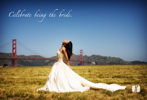
Weddings!
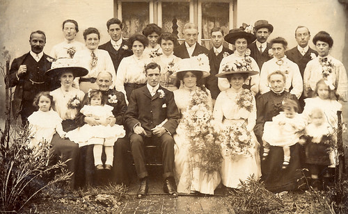
In the past, wedding photography has been limited to societal norms and expectations - it was designed more to document the historical event (in terms of who was present) rather than to provide happy memories for the loving couple. This reluted in most images simply being a whole family portrait in formal and rigid poses.
While the current trends still provide this historical data, it has become a lot more involved in the day by shooting everything from the engagement through to getting ready on the big day and finishing with the reception. With this new contemporary approach to wedding photography comes a broad range of new styles such as photojournalism, glamour and high fashion.
Click on this link for more information on the changing styles of weding photography.
Below are some images showing the changing styles in wedding photography.


What direction do you think wedding photography will take in the near future? Will it get even more out there or will the more taditional styles be making a comeback?
Fran, Richard & Liz
Thursday, March 5, 2009
IN THE BEGINNING...
During our discussion today we thought we would exlpore the various trends that may be emerging within related areas of Imaging Trends including Image Capturing eg: HDR, Composition styles, Candid Portraiture among others, along with Printing & Presentation formats incl: Acrylic, Canvas, Wallpaper & Artblocks. Within this group discussion we willl explore both the creative & commercial genre's of photography and observe the related emerging developments. As we are working in a creative group dynamic, each member of the group wil be offering their own unique perspective.
What is Sleeveface?
Sleeveface is an internet phenomenon wherein one or more persons obscure or augment body parts with record sleeve(s), causing an illusion. Sleeveface has become popular on social networking sites.
The precise origin of the concept is unknown. A collection of photographs was posted online at Waxidermy.com in early 2006, but a 2008 BBC article claims the idea was created by a group of people in Cardiff, Wales. Cardiff's Carl Morris has compiled a book on the subject.
One case of a "sleeveface" before the internet phenomenon and website was ab album cover by DJ J Rocc, whose own sleeve (front and back) was done in the group sleeveface style.
To view some of these images click here
Subscribe to:
Posts (Atom)